StockNews Case Study
StockNews.ai

Overview
Empowering Investors to Scan Fast, Search Deep, Act Confident
As a Founding Designer at StockNews.AI, I led the end-to-end redesign of an AI-powered financial news platform from 0 to 1 — rebuilding the core product experience across three features while establishing the design system that made it all possible.
Professional investors were drowning in financial data. The existing product had no clear information hierarchy, no shared design foundation, and no way to connect market signals to a user's own portfolio. Every feature was a one-off.
I redesigned from the ground up: starting with the AI Newsfeed to solve information overload, then extending into Smart Search and a Personalized Dashboard to take users from passive reading to confident decision-making.
Impact: ↑58% Free-to-Paid Conversion · ↑23% Daily Active Users
Silver Winner - MUSE Design AwardsContext
Redesigning for Value, Not Just Aesthetics
Research
When I joined StockNews.AI, conversion wasn't moving. The CEO's hypothesis: the product looked immature, so users weren't willing to pay. I initiated user research to pressure-test this assumption, and what we found was more fundamental than a visual problem.
Users were telling us:
"There's too much going on. I wish I could set preferences for the kind of news I want."
"It takes me too long to process what's important in each card. I wish the design helped highlight the key points more."
"I check the news multiple times a day, but I don't have time to read everything. I just need the key takeaways."
CEO
Users
Insight & Challenge
The real barriers to conversion weren't aesthetics. They were three interconnected problems:
- Value wasn't legible fast enough
Users couldn't quickly identify what was relevant to them. Every news card competed for equal attention, making it impossible to scan efficiently. - Features were invisible
Users didn't know AI Events existed. Most had never used the filter system. The product had more value than users could find. - The free tier removed upgrade pressure
Ten articles per day was enough for casual users. Without experiencing the full product, there was no reason to pay.
This reframed the design challenge entirely. It wasn't "make it look more polished." It was "make the value impossible to miss."
Strategy
With a clear problem definition, I worked with the team to map short and long-term priorities.
Short-term: Fix the value communication problem
Redesign the core newsfeed experience so users could extract value in seconds — not minutes. Surface features that were already built but invisible. Give users enough personalization to feel like the product was working for them specifically.
Long-term: Move from passive AI to agentic AI
User research consistently pointed toward a deeper need: users didn't just want to read market news, they wanted the product to help them act on it. Combined with broader AI product trends, this shaped the direction for Smart Search and Personalized Dashboard — shifting the product from a news aggregator toward an AI-powered investment assistant.
Feature 01
AI NewsCard: Making Market Signals Impossible to Miss
Problem
Scannability & Feature Discoverability problems were blocking conversion.
- Scannability
Every element on the card competed for equal attention. Users couldn't identify what was relevant fast enough to justify paying for a premium product. - Feature Discoverability
Watchlist and AI Events existed, but users couldn't find them. Features that should have driven engagement were invisible in the navigation.

Solution
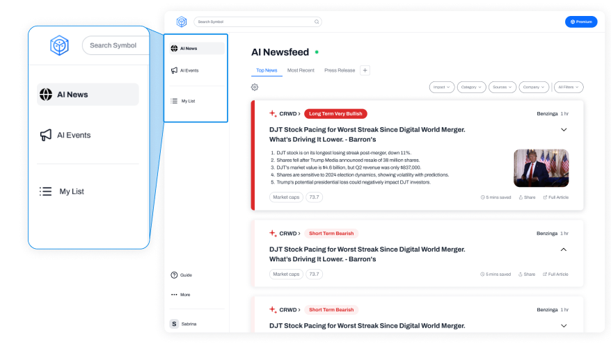
Card level for scannability, navigation level for discoverability
Card Level
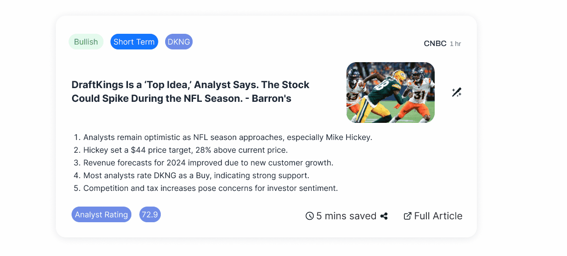
01 Reorganize Information Priority
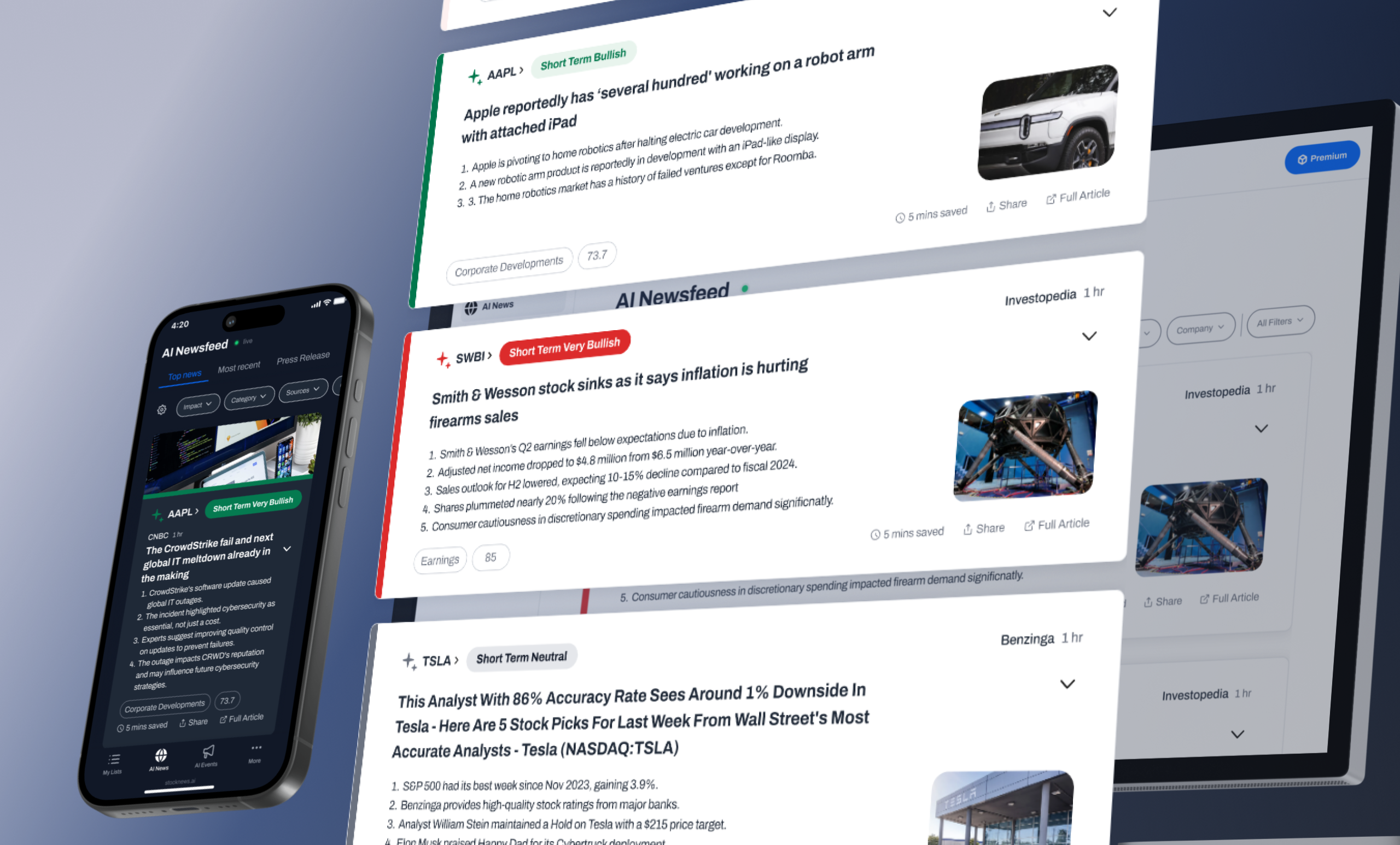
Investors don't read news cards — they filter them. The first question is always "is this relevant to me?", not "what does this article say?"
The original card led with source information. I reordered the hierarchy to put Stock & Prediction signal first based on our research feedback, so users could make the relevance judgment in one glance, before committing to reading anything.
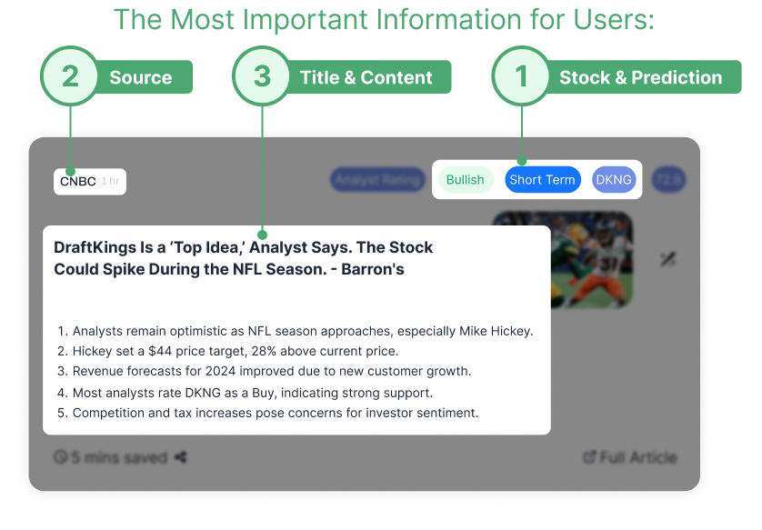
02 Refine Labeling System
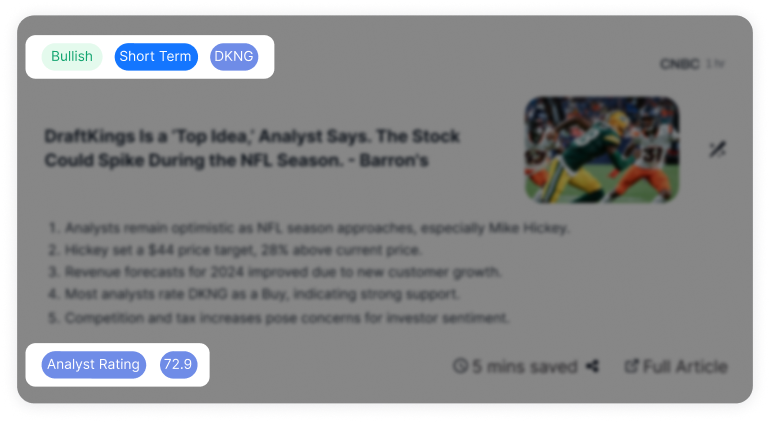
The original tags were semantically unclear: sentiment, timeframe, and category labels all looked the same, forcing users to read every tag to understand its meaning.
I established a clear taxonomy with distinct visual treatments for each type: sentiment (Bullish/Bearish/Neutral), timeframe (Short Term/Long Term), and category (Earnings/Market Recap/Economic). Signal type became parseable at a glance.
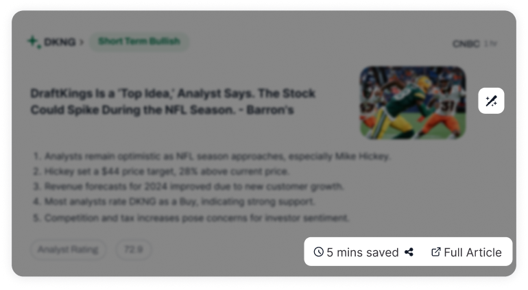
Overuse of Color Labels Causes Visual Clutter
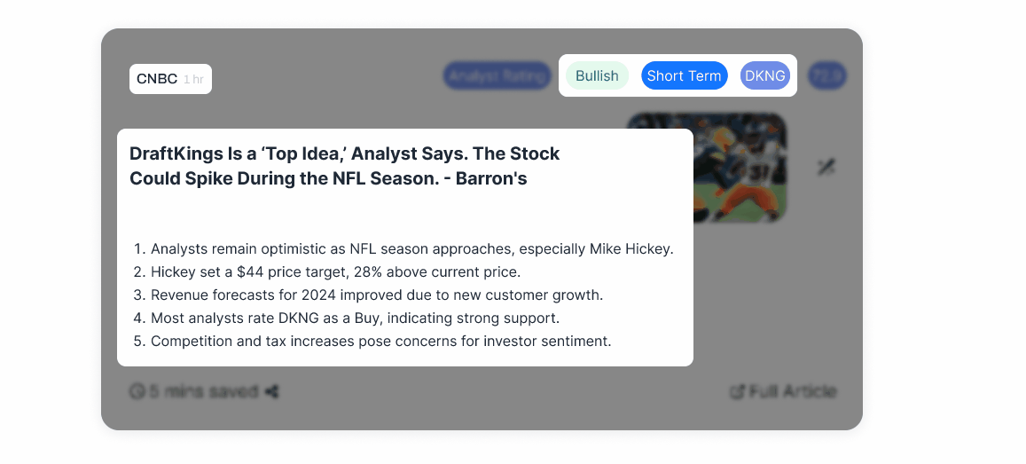
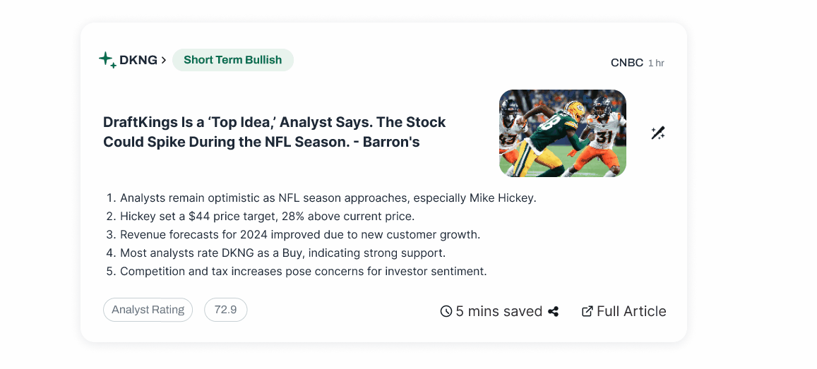
03 Restructure Visual Hierarchy
With the information priority defined and the labeling system rebuilt, I refined the visual hierarchy to make the new order legible: replaced confusing icons with clearer alternatives, standardized type size and spacing across equivalent information levels, and added a left-edge visual cue on each card — so when cards stack, users can scan the feed vertically without opening anything.
Confusing UI Elements Reduce Clarity
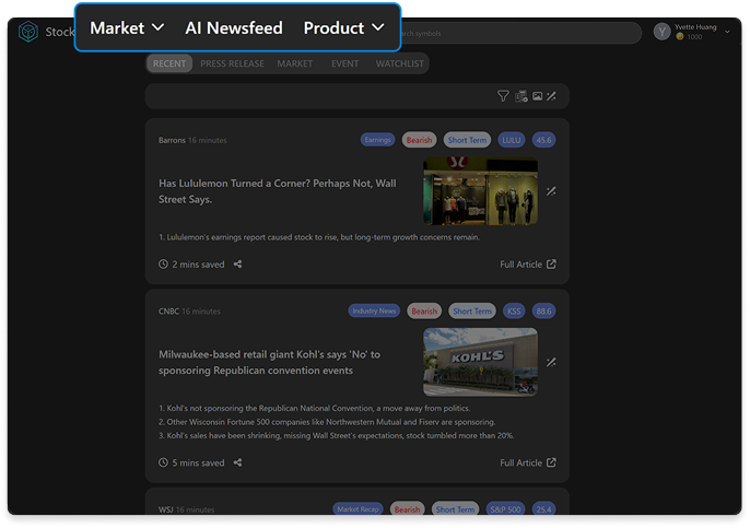
Navigation Level
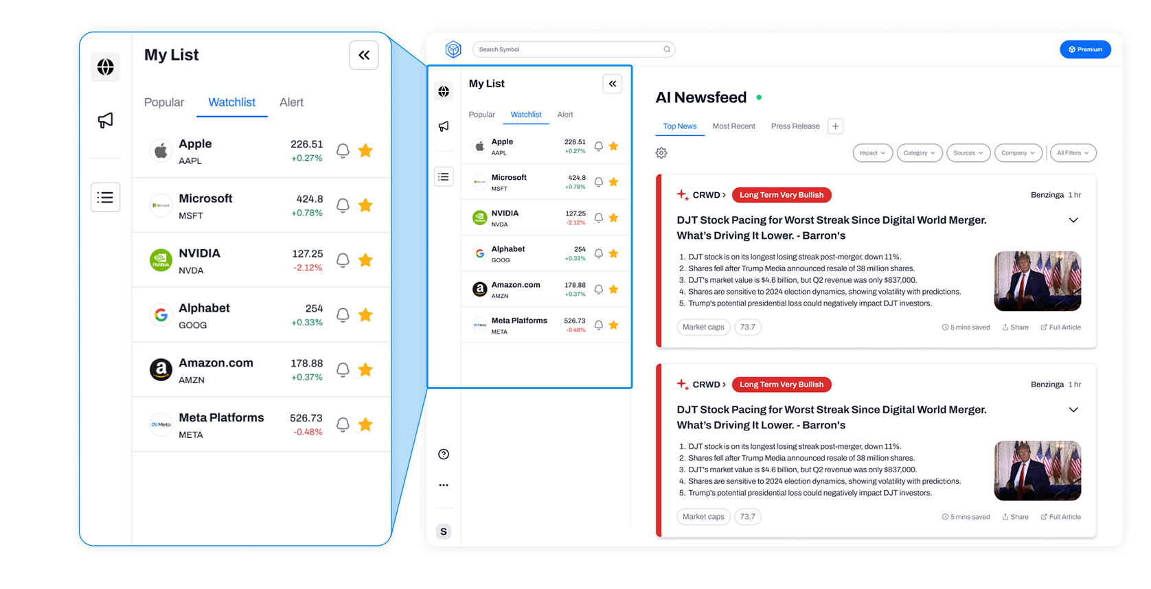
Research showed users constantly switching between the newsfeed and their watchlist. This wasn't a visual problem, it was a structural one.
Moving from a top navbar to a persistent sidebar kept Watchlist always in view, turning a buried feature into a constant presence. The goal wasn't better-looking navigation. It was making personalization feel inevitable.
01 Surface AI News and AI Events as Primary Entry Points
AI Events had low discoverability in the original top navbar. Moving it to the sidebar alongside AI News gave both features equal presence, users could see what the product offered without having to look for it.
02 Watchlist feature
Placed the Watchlist sidebar in direct contrast with the main feed, so users could see their personal holdings alongside market news without switching context. The juxtaposition was intentional: it made the product feel like it was responding to you, not just broadcasting to everyone.
Impact
Silver Winner - MUSE Design Awards
The redesign enhanced user experience while also contributing to business goals like higher engagement and revenue.
Also got positive feedbacks from follow up user email survey:
“It's easier to scan right now”
“Convenient to have watchlist aside!”
23%
Increase in
Daily Active Users
58%
Increase in
Free-to-Paid Conversion Rate
From passive information to actionable advice.
With the core feature redesign complete, the focus shifted to building what was next. The goal from the start was to move StockNews.AI beyond passive information delivery, toward a product that actively helps investors make decisions. Smart Search and Personalized Dashboard were the first steps in that direction.
Feature 02
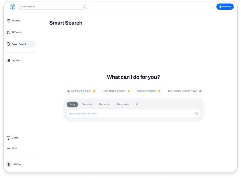
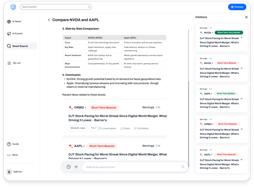
Smart Search:AI-Guided Search with Traceable Sources
Context
Professional investors need to verify AI findings, not just receive them. I designed the Smart Search experience around two AI behavior principles: surface citations for every financial claim, and guide off-topic queries back to financial context rather than refusing them outright.
Feature 03
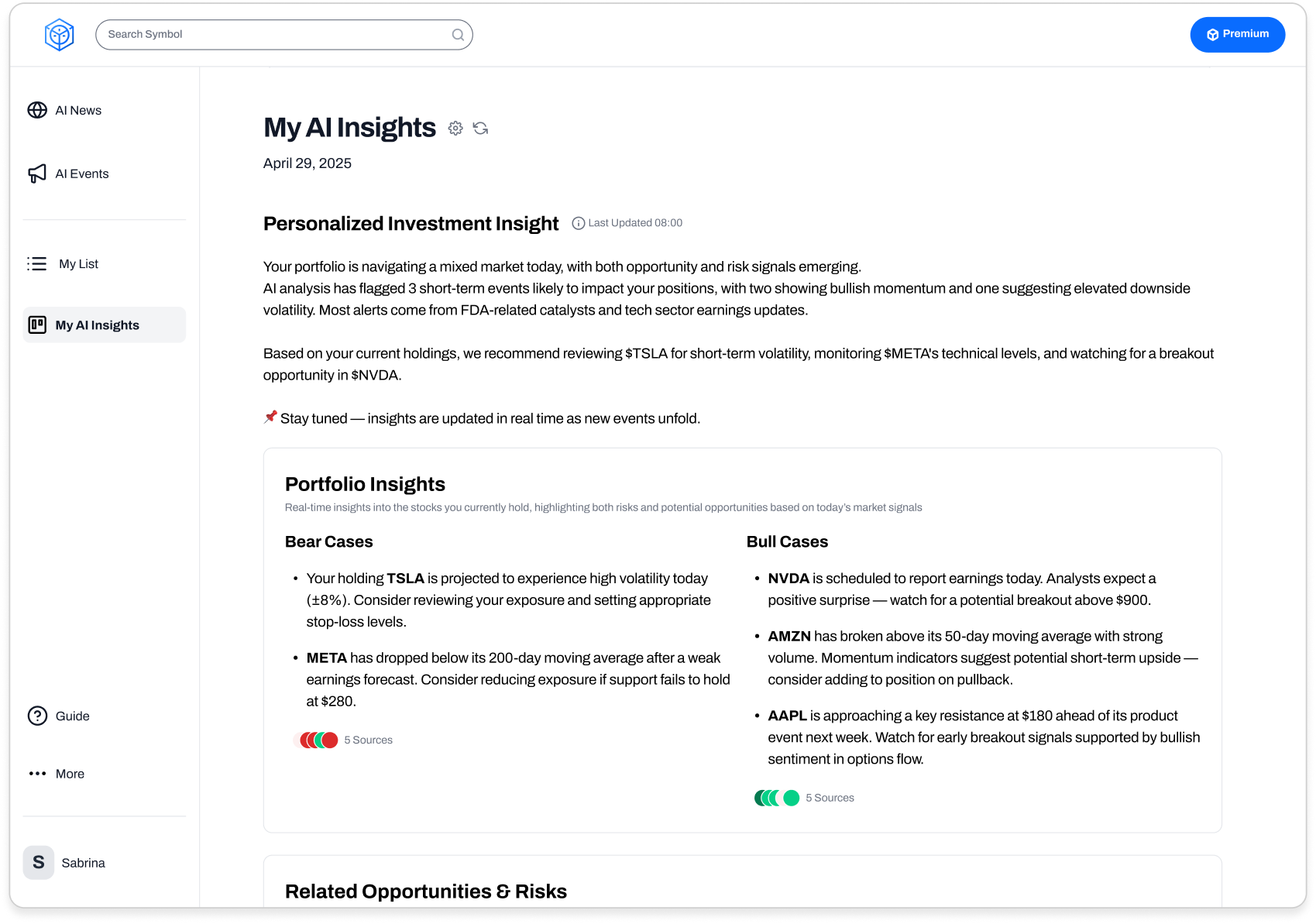
Personalized Dashboard:From Passive Reading to Confident Action
Context
The product was telling users what the market was doing. It wasn't telling them what to do about it. I designed the Dashboard to connect AI market predictions to each user's specific portfolio, shifting the experience from broadcasting to advising.